
|
I would like to share a little of my thought process on how I prepared for the forthcoming SCBWI conference in Los Angeles. 1. Your art should look professional. This is actually a multi-step process. ---Clean up your image before scanning or before having it photographed. Erase any smudges and trim any unsightly borders. After scanning or photographing, if it still needs to be cleaned up, do it in Photoshop or another photo editing program. There's no need to see spills, smudges, fingerprints, or dust marks. Make sure you scan your work properly at 300dpi for print quality and save a copy under a different name at 72dpi for web purposes. Be sure to adjust for color and contrast (and that your monitor is calibrated). If you have digital details to add, like the covers of the books, do it now. You can see the difference between the unaltered scan and the image that has been adjusted to match the drawing.
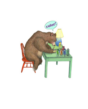
---Get good quality prints! It's a bad idea to have originals in your portfolio, in case of theft or loss. Conferences like SCBWI actually does not allow them during the portfolio review. So make a good quality print of your work that will capture the detail and color appropriately (hence the good scan tip, above). It's not worth it to skimp costs here. This is how your work will be seen by the world. ---Choose a professional presentation portfolio. A few years ago, I purchased an 8.5x11 Pina Zangaro black presentation book. It screws open and closed to allow for additional pages, and has clear, archival sleeves with black backing, just in case the picture does not fill up the entire 8.5x11" space. It's hardcover, durable, protects my art, and looks like I care. 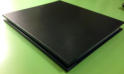 2. Choose only your best pieces. 10-15 good pieces are better than 30 mediocre images that show no real focus. Try to make sure that your work is coherent and forms a beautiful whole. Only show images that align with the type of art you would like to make in the future. For instance, my portfolio pieces are clearly not geared to board books or educational books, and that's fine. I know who I want to attract. You may consider showing a mix of children, adults, animals, and even creatures (I snuck one troll into the portfolio). Make sure you show some environments and different lighting or atmospheric situations if appropriate. This time around, I added text into some of the illustrations so others could visualize how they would look in a printed book. --Know your audience. This particular portfolio selection was made for a Children's Book conference, but it's important to know your audience. Trying to get graphic design work? Don't show pet portraits. Trying to get illustration work? Leave out professional design work, like logos, and stay away from images that don't tell a story, like simple portraits. ---Find the best order for your works. This is not my final layout, but I was still trying to determine order and which pieces to include. Arranging it out on the floor helped me to visualize sequence. 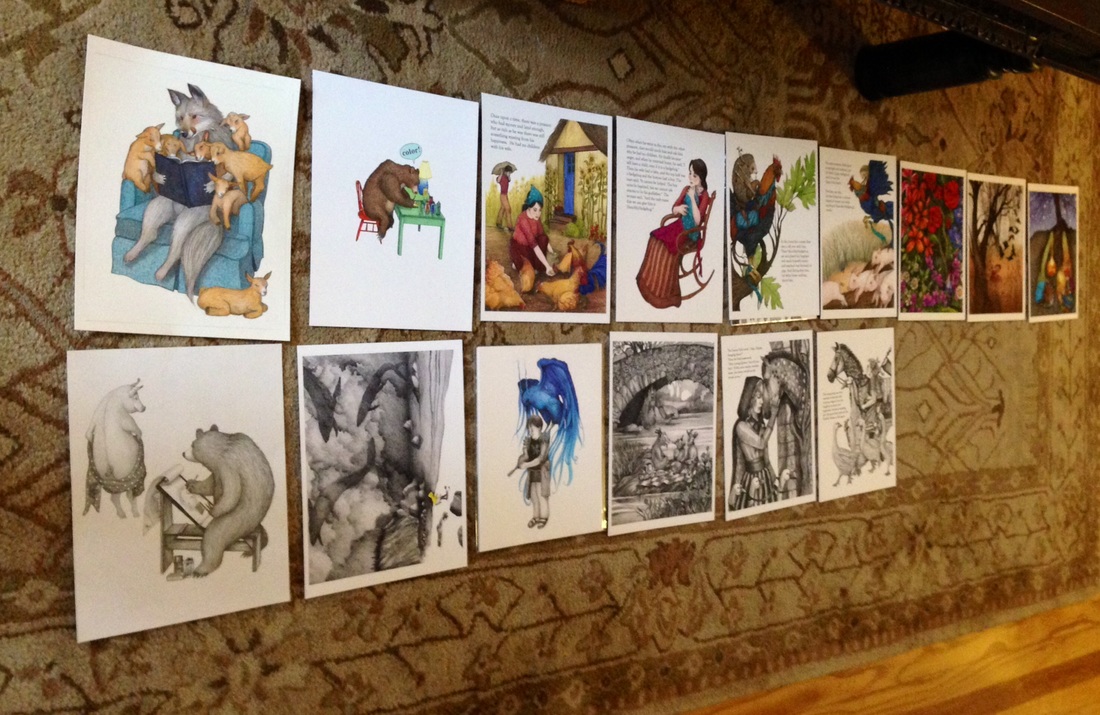 ---Get another pair of eyes to look at your work. Speaking with my illustration peers was very helpful for arranging the portfolio. They saw things that I did not. I ended up grouping by color and by like pieces. ---Don't neglect your best dummy images. My illustration group gave an excellent suggestion: do not neglect to add the color spreads from your dummy into the portfolio itself, just in case the editors and agents do not have time to look at the dummy. --Start with and end with pieces that pop. Why not make your best first and last impressions? --Show both color and black and white. Here I really speak from experience. Last time, I had an entire black and white portfolio, and the feedback I got? People were unsure if I could handle color, if I was unwilling, or even afraid to do it. Since they could not see how I used color, they could not visualize it, and just so. Each person uses color so differently that there is no real way to visualize how one artist will execute in color. So show what you can do--in color and black & white. In preparation for this idea, I made dividers for the color section and the black and white section, joined by theme and execution.
3. Don't forget to introduce yourself! Include a title page at the start and a bio page as well. I believe these images should match up in theme and style to other works in the portfolio. The first set is from my old black and white portfolio, which had many fanciful creatures:
The next set is from my new portfolio, which is heavily geared to fairy tale:
4. Make sure you bring your dummy (more than one!), and make it look as nice as possible. 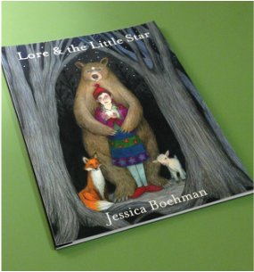 5. Don't forget business cards and postcards! Again, this should focus on the type of work you ideally want to create in the future. 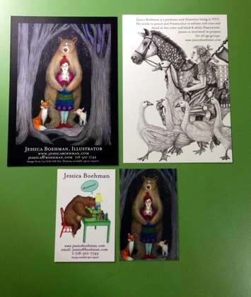 If you have other suggestions, let's hear them in the comments!
1 Comment
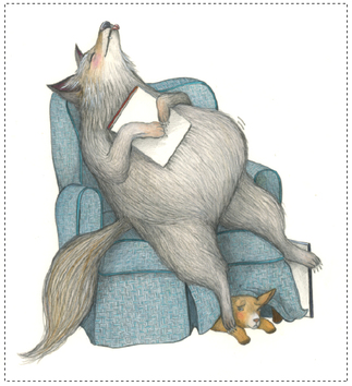
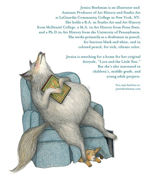
This is the last page for my portfolio that I made for the SCBWI summer conference in Los Angeles. This one will be my bio page (stay tuned for the next post to learn more about that process). It's meant to pair with the cover page image of the Wolf and the Seven Little Kids (see previous post). "Bedtime Snack". Mixed media. Copyright 2015 Jessica Boehman. Do not reproduce or repin without permission. 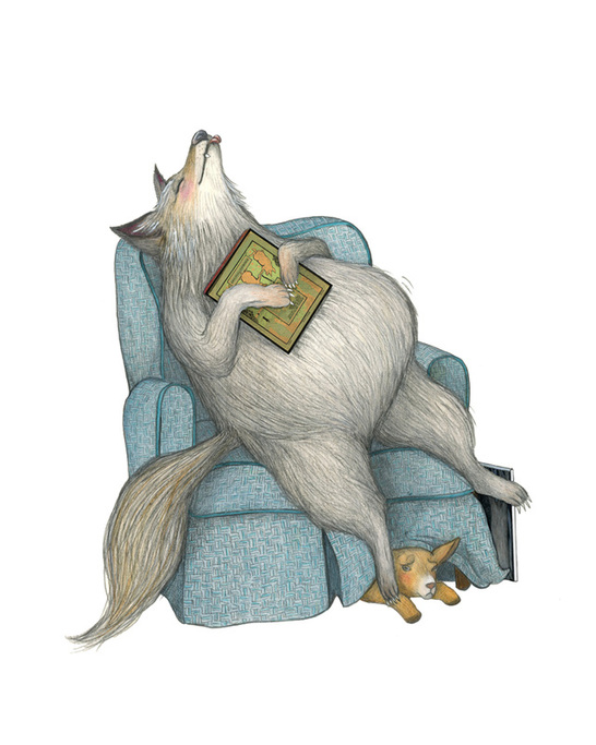 Now all we need is Mom to save the day. Isn't that always the way, anyhow? If you look closely, you can see that after eating he read himself to sleep. The book on his belly is The Story of the Three Little Pigs, illustrated in the 19th century by L. Leslie Brooke. 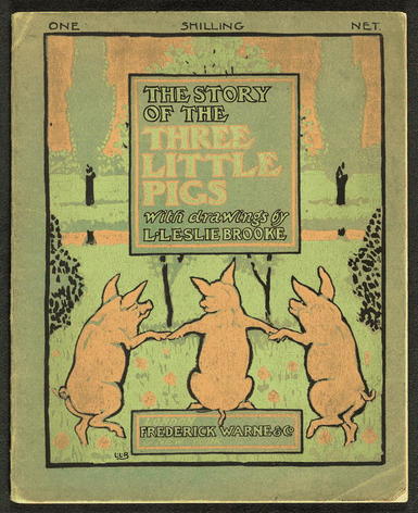 Anyone who knows me knows that I like to spin a yarn or two. I tell stories everywhere, especially with friends, family, and in class. I always say, "That which does not kill you makes a good story." When I was in elementary school in Bremerhaven, Germany, the school district held a storytelling contest. Somehow I knew that one was for me. I never entered talent contests, as I can't sing or dance or do any of those other public talents. But this one, this one, was for me! So I went to our tiny school library and got out a book of Grimm's fairytales. It's the first time I remember looking at the compilation instead of children's books of individual Grimm's tales. I picked the macabre story of the Wolf with the Seven Little Kids for the contest. If you don't know this story, go look it up. I had voices and gestures for the mother and kids, and for the wolf as he changed his appearance and then his voice, swallowing the lump of chalk to sweeten his gruff growl. I gestured as he ate the six of the seven baby goats, having finally tricked them, and imagined the still-living goats tumbling out of his cut belly when their mother came to the rescue. I won the first round of contest and went to district, where I lost to the hometown girl telling a thirty-second JOKE. That one still stings, 25 years later! Ha! This will be the cover of my portfolio. It's a nod to the story, not an illustration from it, and a love letter to my start at storytelling. CHOMP! "The Wolf and the Seven Little Kids". Mixed media. Copyright 2015 Jessica Boehman. 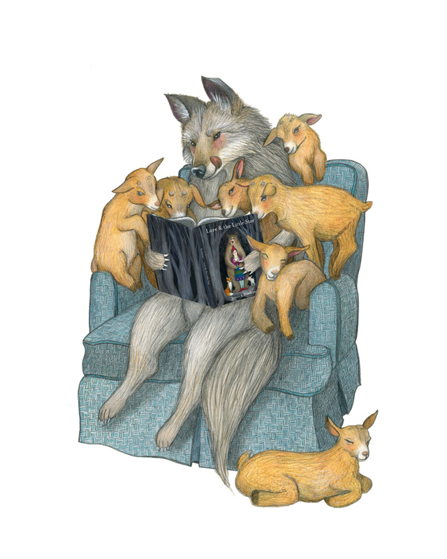 Black and white divider for the portfolio. Brainstorming for this one was the result of a long close-quarters drive with my brothers Chris and Josh. That should explain it. Yeah. 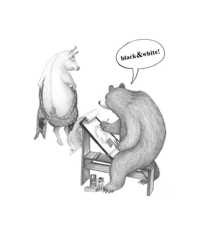 I sent my dummy out into the world with a black and white cover, but I wanted a color pop for presenting it at the portfolio showcase at SCBWI. Here is a little about my process. I started the two pictures of the night forest at my parents' home in Maryland. I didn't trust myself to do the detail work of the characters in a setting where I would not have quiet and concentration for hours on end, so I did the heavy layer work of the trees and sky. As you can see, I laid out the front cover with a hole in it. This would allow me to drop in the image of the characters, drawn at a larger scale for better detail, in Photoshop. 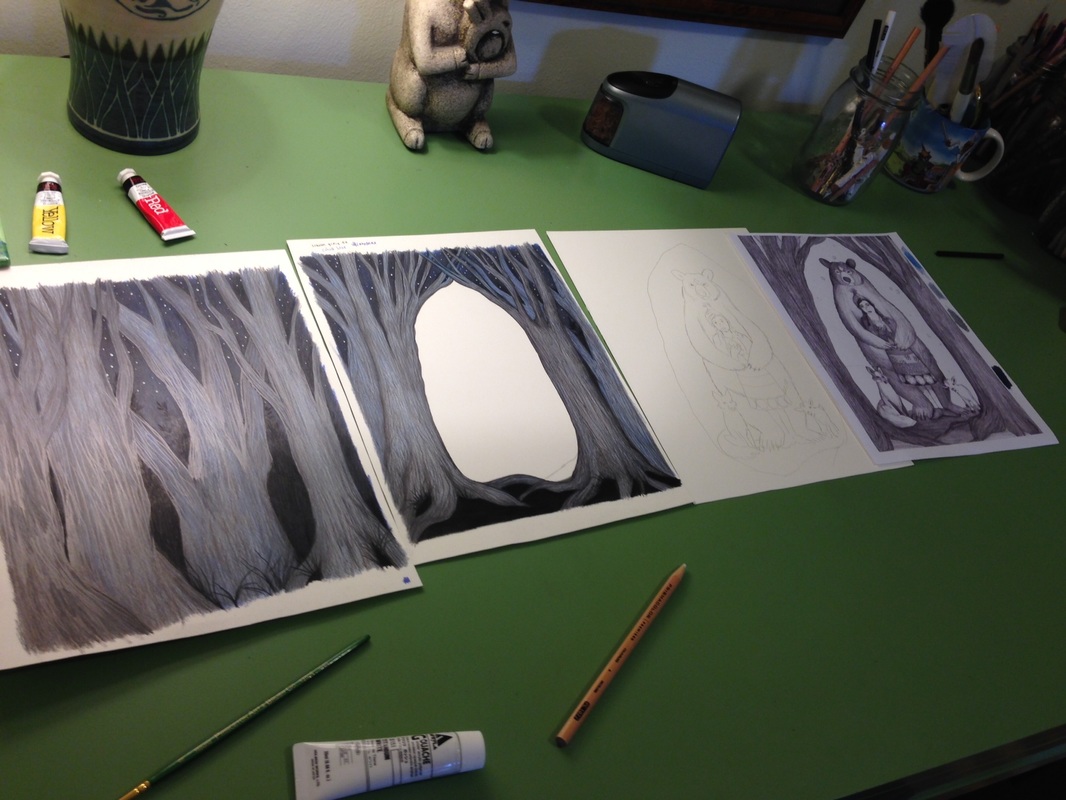 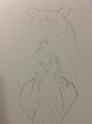 When it came time to work on the characters, I used my light board to transfer the black and white drawing I had made for the dummy to my Arches Hot Press 140lb paper. Hot press paper is smooth and very heavy, so it will take many layers of color without rippling the paper, and is smooth enough to allow for delicate detail. However, it is a pretty soft surface, which means that it doesn't erase well. So draw lightly, and then use a barrel eraser to pick up as much extra graphite as possible, leaving only a bare outline. This will guide your pencil and minimize the risk of smearing the graphite into the lighter tones of the colored pencil. You can see I only have the barest lines possible...hardly any detail at all. That's ok...I have my black and white drawing as reference. 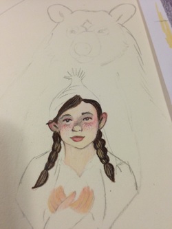 As you can see, the process of colored pencil is a gradual one. The thing about colored pencil: it looks bad until it looks good. You have to be patient. There are many layers of bad before it becomes nice, and you have to trust in your plan, be careful, and allow the layers to work together. I always work on the hardest parts first: the faces and hands. If they look bad, it's worth it to start over as you haven't invested much energy into the drawing at this point. Below, the figure of the girl is progressing. Take care when layering the color to carefully brush away any color wax dust that the pencils kick up, and to use the barrel eraser to pick up any residue, ensuring a clean surface. I prefer a barrel eraser as it offers some control. I also have a tiny barrel eraser for detailed erasure. 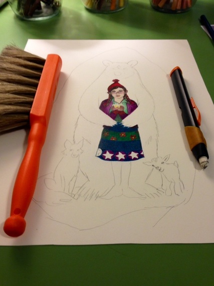 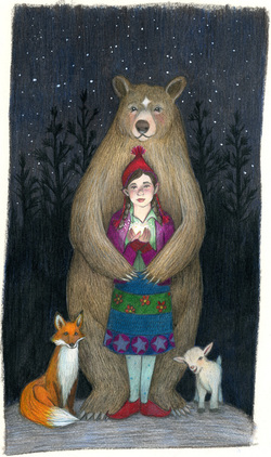 I drew the "background" of the cover as a larger image to give myself some room to move it around in the composition. I like here how they are out in the open, knowing that they will soon be in the forest. The grey blue sky feels like winter to me. I used graphite for tone and detail and gouache to brighten the star and to add the twinkling of the night stars. When you are finished, be sure to use a good quality fixative, and spray the drawing outside for ventilation. Your neighbors will think you are a vandal, but it's all for the good of your professional mystique. Below: The final cover image of "Lore and the Little Star" without text. Colored pencil, pencil, and gouache. Copyright 2015 Jessica Boehman. Please do not reproduce without permission. 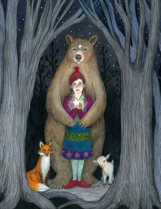 |
Hans-My-HedgehogHans-My-Hedgehog Illustrations is the name of Jessica Boehman's blog and illustration shop. It is named after her favorite fairy tale about a hedgehog boy who becomes king of the forest. All other pages redirect to: |

 RSS Feed
