|
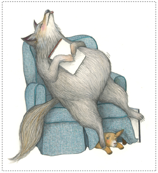
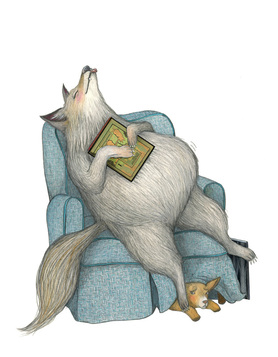
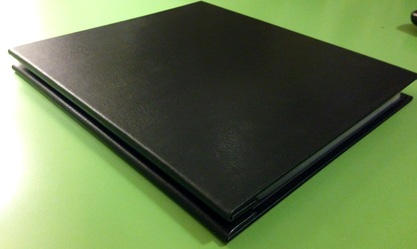
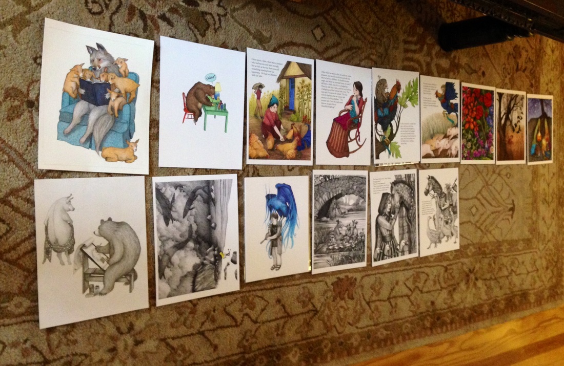
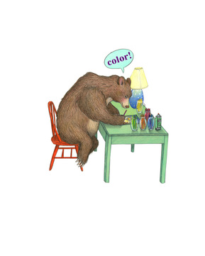
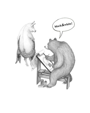
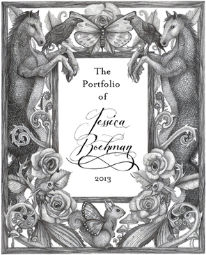
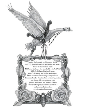
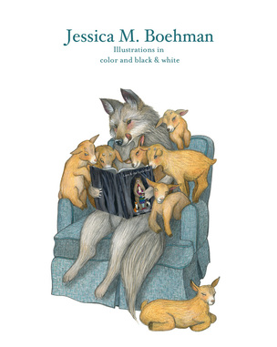
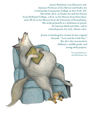
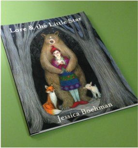
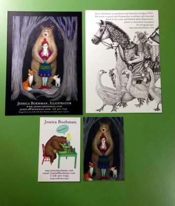
I would like to share a little of my thought process on how I prepared for the forthcoming SCBWI conference in Los Angeles. 1. Your art should look professional. This is actually a multi-step process. ---Clean up your image before scanning or before having it photographed. Erase any smudges and trim any unsightly borders. After scanning or photographing, if it still needs to be cleaned up, do it in Photoshop or another photo editing program. There's no need to see spills, smudges, fingerprints, or dust marks. Make sure you scan your work properly at 300dpi for print quality and save a copy under a different name at 72dpi for web purposes. Be sure to adjust for color and contrast (and that your monitor is calibrated). If you have digital details to add, like the covers of the books, do it now. You can see the difference between the unaltered scan and the image that has been adjusted to match the drawing. ---Get good quality prints! It's a bad idea to have originals in your portfolio, in case of theft or loss. Conferences like SCBWI actually does not allow them during the portfolio review. So make a good quality print of your work that will capture the detail and color appropriately (hence the good scan tip, above). It's not worth it to skimp costs here. This is how your work will be seen by the world. ---Choose a professional presentation portfolio. A few years ago, I purchased an 8.5x11 Pina Zangaro black presentation book. It screws open and closed to allow for additional pages, and has clear, archival sleeves with black backing, just in case the picture does not fill up the entire 8.5x11" space. It's hardcover, durable, protects my art, and looks like I care. 2. Choose only your best pieces. 10-15 good pieces are better than 30 mediocre images that show no real focus. Try to make sure that your work is coherent and forms a beautiful whole. Only show images that align with the type of art you would like to make in the future. For instance, my portfolio pieces are clearly not geared to board books or educational books, and that's fine. I know who I want to attract. You may consider showing a mix of children, adults, animals, and even creatures (I snuck one troll into the portfolio). Make sure you show some environments and different lighting or atmospheric situations if appropriate. This time around, I added text into some of the illustrations so others could visualize how they would look in a printed book. --Know your audience. This particular portfolio selection was made for a Children's Book conference, but it's important to know your audience. Trying to get graphic design work? Don't show pet portraits. Trying to get illustration work? Leave out professional design work, like logos, and stay away from images that don't tell a story, like simple portraits. ---Find the best order for your works. This is not my final layout, but I was still trying to determine order and which pieces to include. Arranging it out on the floor helped me to visualize sequence. ---Get another pair of eyes to look at your work. Speaking with my illustration peers was very helpful for arranging the portfolio. They saw things that I did not. I ended up grouping by color and by like pieces. ---Don't neglect your best dummy images. My illustration group gave an excellent suggestion: do not neglect to add the color spreads from your dummy into the portfolio itself, just in case the editors and agents do not have time to look at the dummy. --Start with and end with pieces that pop. Why not make your best first and last impressions? --Show both color and black and white. Here I really speak from experience. Last time, I had an entire black and white portfolio, and the feedback I got? People were unsure if I could handle color, if I was unwilling, or even afraid to do it. Since they could not see how I used color, they could not visualize it, and just so. Each person uses color so differently that there is no real way to visualize how one artist will execute in color. So show what you can do--in color and black & white. In preparation for this idea, I made dividers for the color section and the black and white section, joined by theme and execution. 3. Don't forget to introduce yourself! Include a title page at the start and a bio page as well. I believe these images should match up in theme and style to other works in the portfolio. The first set is from my old black and white portfolio, which had many fanciful creatures: The next set is from my new portfolio, which is heavily geared to fairy tale: 4. Make sure you bring your dummy (more than one!), and make it look as nice as possible. 5. Don't forget business cards and postcards! Again, this should focus on the type of work you ideally want to create in the future. If you have other suggestions, let's hear them in the comments!
1 Comment
Annina Luck Wildermuth
7/19/2015 02:27:53 am
Well done! All your work is so wonderful and stands out. Good luck in LA!
Reply
Leave a Reply. |
Hans-My-HedgehogHans-My-Hedgehog Illustrations is the name of Jessica Boehman's blog and illustration shop. It is named after her favorite fairy tale about a hedgehog boy who becomes king of the forest. All other pages redirect to: |

 RSS Feed
