|
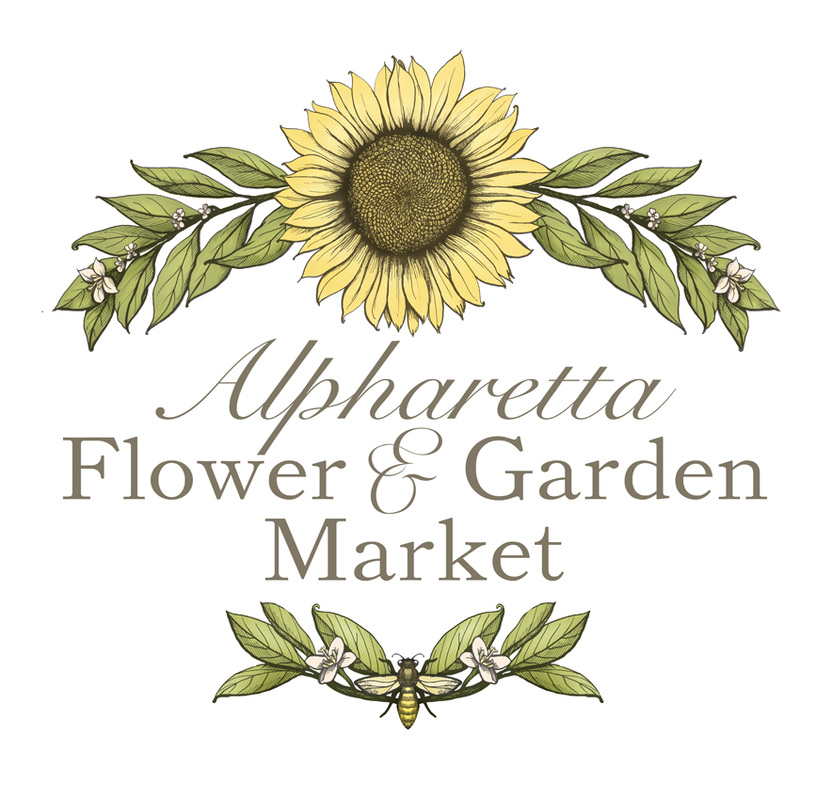
Three years ago, I made a logo for a shop called Alpharetta Flower Market in a town in Georgia of the same name. The proprietor wanted a logo that was rich, colorful, and had a 1920s vibe. She wanted the sunflower as the centerpiece and noted a few other flowers that she wanted to include. This is what we came up with together. It was draw in pencil, scanned, cleaned, and digitally colored, so that it could shrink or expand without loss of color integrity. The proprietor approached me again this summer. Her store was rebranding and expanding as Alpharetta Flower & Garden Market. They wanted to keep the sunflower and the bee, but wanted simpler, lighter, airier signage, with the main focus on the name, so it could be read from the street. She gave me some hints for color notes, and with that, I had a good feel for what she wanted: something fresh and springy but with a botanical print feel to it. This is what we created together! I drew it in ink for bolder lines and colored it digitally. Here is a detail of the head of the sunflower. If you are interested in commissioning an illustrated logo for your business, please contact me here.
0 Comments
Leave a Reply. |
Hans-My-HedgehogHans-My-Hedgehog Illustrations is the name of Jessica Boehman's blog and illustration shop. It is named after her favorite fairy tale about a hedgehog boy who becomes king of the forest. All other pages redirect to: |


 RSS Feed
