|
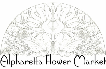
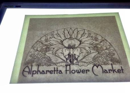
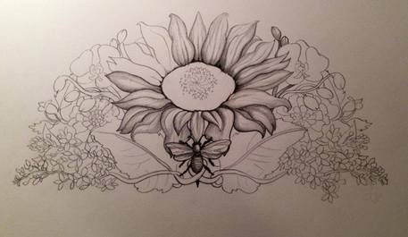
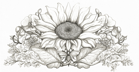
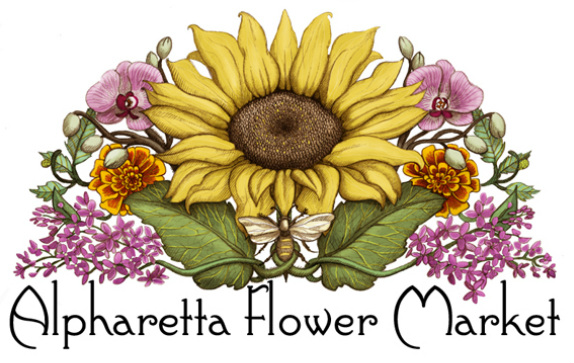
It happens sometimes that I get interest from a potential client after they have seen a design that I have created for one business that is similar to what they want for their own business. This is a great way for me to get attention to my work, because it allows the client to visualize how their own concept might look without too much risk on their part. For me, the challenge is making sure they get something that is uniquely their own, even if one of the elements (subject, theme, etc.) are the same. This happened with the owner of Alpharetta Flower Market, who was looking to find a vintage style sunflower logo for her business. She saw the logo I had created for the Sunflower Farm Creamery (whose owner had, in turn, been inspired be some of my other drawings). She, too, was looking for a sunflower logo, but with a rich, vintage, elegant feel to it. Photos she sent me of her lovely shop helped me to visualize what it might look like. I started by offering her color-blocked layout suggestions so I could understand what shape she was considering, and by suggesting an elegant font that looked like it had an elegant 1920s vibe to it. I also liked how the text reminded me of the stalks of flowers done by Mucha. Once she approved a shape for the composition, I sent her a very loose pencil mock-up, as you see here. I transferred the approved image in very light lines to my good Arches Hot Press Paper, which honestly is not terribly ideal for pencil work on its own, but gives such a smooth surface that it is good for a project like this. Shortly thereafter we also decided on the addition of a bee, which was great for me, considering I had written my master's thesis on a portrait bust bearing the Barberini bee, and had used the bee on my own wedding invitation and as a decoration on the base of my bridal bouquet. I did a lot of hatching style shading in this to give it the look of an old print. Once the pencil work was complete, I scanned it and cleaned it up on Photoshop. To give the drawing a more vintage vibe, I altered the pencil in Photoshop to a rich brown, and added the digital color on a layer below the pencil drawing. I added a few lilac blossoms dipping down toward "Market" to make it a little whimsical as well.
1 Comment
Melinda.Margaret Park
10/5/2013 01:07:36 am
Your sunflower art is so beautiful that it warms my heart and brings tears to my eyes. One of my fellow educators here in Noth Delta, BC, posted your Halloween hedgehog on Facebook this week, and I was charmed and intrigued. I would love to purchase a set. Of your cards to start, however they are no longer available on etsy.com.
Reply
Leave a Reply. |
Hans-My-HedgehogHans-My-Hedgehog Illustrations is the name of Jessica Boehman's blog and illustration shop. It is named after her favorite fairy tale about a hedgehog boy who becomes king of the forest. All other pages redirect to: |
 RSS Feed
